I absolutely love Prima Marketing and everything they do. Their colours within each line just blend beautifully and make working with them a dream.
For some reason though, I’ve never been and explored their blog - big mistake! I went over a few days a go and had a browse and saw that they had this colour palette inspiration challenge.

Oh my, aren’t those colours stunning?!!!
Anyway, the colours caught my attention and gave me the inspiration to scrap a photo I’ve been meaning to do for ages. I don’t have a lot of photos of me as I normally stand the other side of the camera and the fact that I don’t like my picture being taken, but I don’t mind this one - partly because of the cute, hubby-cheeked lil man stealing the limelight :)
Here is my layout:

I used a Dusty Attic frame around the page, painted with gesso and some chalk inks and paints in soft greens and rosy coral colours. I rounded off the top of the photo with a prima vine, but knocked back the redness of the flowers with some gesso. I had some pink flowers in my stash so they got blended into the vine and downwards.


The Prima Birds are my favourite embellishments ever, so stunning. I painted these with gesso, then an all over coat of PaperArtsy chalk paint in Irish Cream and dry brushed with snowflake to make them white again, but the cream/brown underneath fitted with the Prima colour palette better.
The tag was a must for me to include, 'things I love', it just had to be included.

I used a beautiful little cameo which I found at The Works, never thought I'd see something like this in there, happily surprised. The clocks are from Maja Design and have been fussy cut from the page and inked lightly.
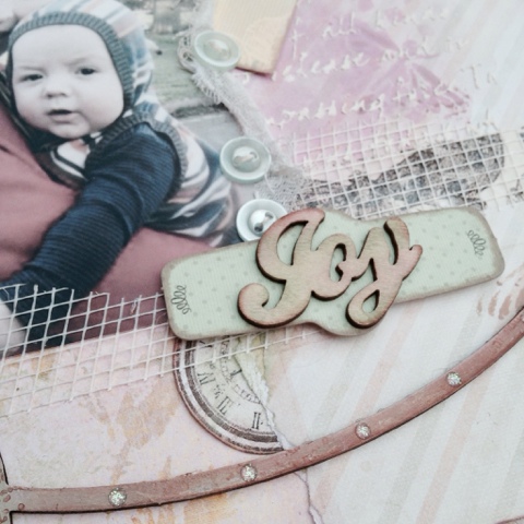
Of course this is all backed by Prima papers - Delight and Art Journal. Only thing I wish I had done was stitch around the page and add more layers. Was so engrossed in the inky creating side - oh well, still learning :) I had great fun with this page x
Would like to enter this into the Prima Product Picks for June.
Oh and I will definitely be going back to Prima's blog, got to get used to the wealth of information out here in the blogging world :)

Your layout is stunning Georgie, I love the soft colour tones, the beautiful framing and how you have cleverly draw the eye in to the lovely photo. Great composition! I hope you do well in the challenge at Prima too. Anne xx
ReplyDeleteThat's an absolutely beautiful layout - love the DA frame (they make such beautiful things, don't they?!), and the colours and embellishing are all perfect around that sweet photo. Lovely!
ReplyDeleteAlison x
Thanks again for your lovely comments. I do love DA bits, they're a great platform for allowing that extra dimension. Will pop over tonight to see what you guys have been working on too (providing my LO goes nicely through the night - he's a little poorly right now) xx
ReplyDeleteThis is so gorgeous! I love the colours, all the elements you have chosen look so pretty together! Good luck with your challenge! ;) Ingrid xx
ReplyDeleteHi Georgie, I just wanted to thank you for your comment on my spritzer holders. If you would like me to make you one, my email address is in my sidebar, just let me know and I will do one for you. Anne xx
ReplyDelete